Creating user-focused content for Acas
In 2018, Acas brought in a Scroll content designer to help rewrite its website guidance for employers, employees and HR professionals.
The challenge
A 2017 content audit, done as part of a wider review of the Acas website, found that:
less than a quarter of the content generated 99% of all page views and downloads
more than one-third of the content was out-of-date or redundant
more content served Acas’s organisational needs than the needs of its main user groups
the content was difficult to read
This audit and other evidence led to another piece of work, known as an ‘alpha’. The Acas digital team – including a product manager, user researcher and content designers – investigated:
the needs the website should meet
what to do to meet these needs
Among other things, they discovered content for employees, especially those with low digital skills, should be kept concise. They also found that the content and design of the website needed to be simpler and clearer, so that users would know they were on the right page.
What they say about working with Scroll
“The Scroll content designer was a valued member of the small team building the new digital advice service and made a significant contribution to the success of the project […] upskilling and mentoring less experienced content designers on the team.”
Acas
The solution
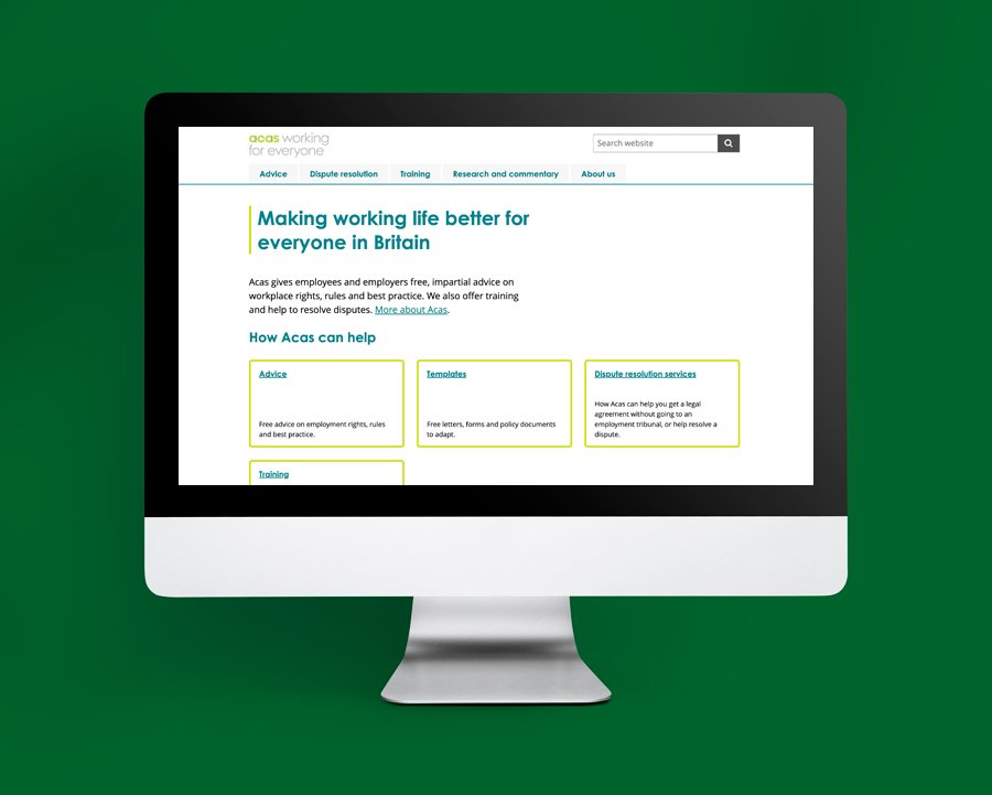
The alpha found that a new project phase – ‘beta’ – was required. This phase would essentially be the creation of a brand new Acas website.
As part of this, content from the old website would need to be ‘transitioned’ to the new website. However, the nature of the problem meant this could not just be a simple ‘lift and shift’. It had to be rewritten from scratch using tried-and-tested content design principles, as used on GOV.UK.
When looking at what content should be prioritised, the digital team took an ‘80/20’ approach. This meant they transitioned the content affecting the greatest number of people first.
Working alongside the digital team, the Scroll content designer bore the following questions in mind before writing any words:
why are we creating the content?
who needs it?
how many people are likely to read it?
what is the impact on users if this is not available?
does it fit with business objectives?
Once the team had identified the top-priority topics – such as hiring staff, discipline and grievance, working hours legislation – they worked through each in turn.
A typical content creation process for each topic would involve:
a ‘discovery’ – gathering data and evidence from the Acas helpline, user research, website analytics and stakeholders
writing a first draft using content design principles (‘F’-shaped reading pattern, plain English, specific and action-focused subheadings, etc)
testing the draft with users (and usually iterating it again) – a brand new process for Acas
fact-checking it with subject matter experts
publishing it on a new ‘Acas beta’ website
continuing to iterate based on any further evidence and user feedback as required
approach and an agile working style, as well as confident communication skills.
Results
The initial benefits of this transition were a positive user response via the website’s feedback form, as well as improved clickthrough rates for many pieces of content including:
‘disciplinary procedure’ (2018 baseline clickthrough was 5.15%, in June 2020 this was 21.67%)
‘grievance procedure’ (2018 baseline clickthrough was 3.67%, in June 2020 this was 14.43%)
‘disciplinary hearing’ (2018 baseline clickthrough was 2.84%, in June 2020 this was 11.49%)
The homepage bounce rate also improved significantly, from 25% in 2018 to 38% once beta became the primary website.